Inside: Increase the versatility of stamp sets like Art Impressions’ Woodland Tree Cubbies by using outside-the-package color schemes, including four examples.
I felt an overwhelming craving last night. Not a craving for creamy ice cream or salty potato chips. Nope, this was a craving to paint.
Do you ever get hankering like that? Like you’re itchy to get inky. Yearning for the rhythm of floss pulling through fabric. Or the need to knead some soft and silky clay.
Or is that just artsy-geeky-maker me?
I wasn’t in the mood for reading my library book (Eligible by Curtis Sittenfeld), nor to watch the next episode of Poldark. As much as I enjoy those, my yen to paint won out.
And I didn’t want to paint in a big and expressive way, but in a cozy, intimate way. I needed something detailed and concise to paint.
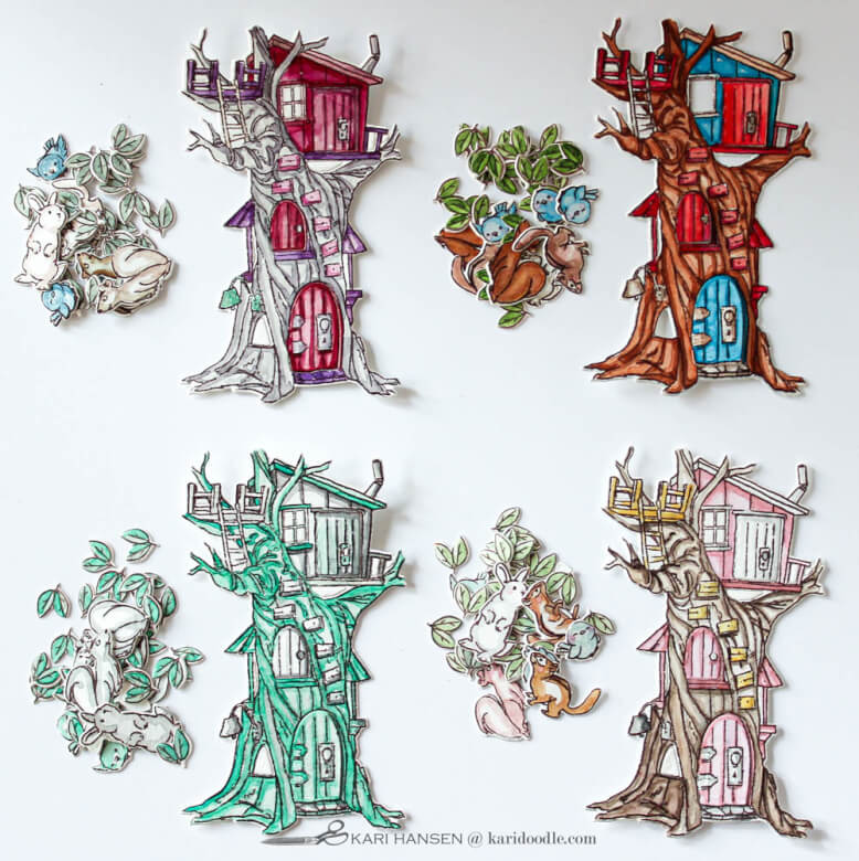
The Woodland Tree Cubbies set was a perfect antidote to my paint ache. The gnarled tree, with its many doors, limbs, and crevices, has lots of opportunities for shades and highlights. The critters are fast and fun and oh, so personable. And the doors and openings that cut effortlessly with the coordinating dies — be still my little cubby-loving heart.
This is what I love about this stamp & die set:
- Multiple pithy sentiment stamps included
- Clever interactive design
- A charming illustration style with lots of humor
- Dies that cut very close to the edge
- Dies that cut windows and door flaps
- Four of the same leaf die, to more efficiently die-cut all those little leaf clusters
- Great value for the price, with both stamps and dies in one set
- Color example on package offers a useful shading guide
- Versatile for masculine, juvenile, and many occasions cards
- A satisfying small-scale project to color and assemble
At first, I painted the images (mostly) following the color scheme suggested on the packaging. That example works as a no-brainer guide for shadow and shading placement. But the Woodland Tree Cubbies set was so satisfying to paint that I couldn’t stop at only one version.
Being a rebellious crafter, I wasn’t content to stick to the color scheme suggested on the packaging. Could I do even more with the stamp set by changing the colors? How would the tree look in other color schemes? In pastels? In muted tones? In monochromatic? This inquiring maker wanted to know.
See more watercolored critter cards: How to Make Crazy Cute Critter Cards for Your Kids’ Teachers
In this post:
How a Change in Color Scheme Adds Value to a Stamp Set
While an illustrational stamp set like the Woodland Tree Cubbies is super fun, there are limits to its versatility. You might use the critters by themselves or borrow the sentiments for another project, but in general, this kind of set is straightforward in its usage.
How can you maximize its value? By changing up how it’s colored. By employing different color palettes and coloring mediums, the same stamp set can lend itself to a variety of looks.
This approach can work even for stamp sets like this one, with more literal imagery. Because who says trees must be brown, or skies can only come in blue, or squirrels can’t be pink?
You’re a doodler! You can create any kind of world you can dream up. Think beyond realism when it comes to coloring your stamps. Experiment with outside-the-package color schemes and extend the value of your stamp sets.
In these examples, I kept to one coloring medium (watercolor) and the same card design. The color palette is the only thing that changes from card to card. While I used watercolor, any other medium, such as Copics, Zig brush markers, or colored pencils, could be used in the same way to apply different color schemes.
You can tailor the color scheme to suit your recipient or occasion. Notice how the overall mood of each card is different, depending on the color palette. One is more youthful, one is more sophisticated. One is bolder, one is softer. One looks contemporary, another looks more retro. The color choices alone have added range to the stamp set.

How to Choose an Outside-the-Package Color Scheme
Tips for picking an alternate color palette:
- Consider who or what the card is for. What kind of colors would suit that recipient or occasion best? Vivid or soft? Masculine or feminine? Vintage or modern? Knowing how you want the colors to feel will help you pick the right color set.
- Find inspiration by looking at pre-designed color palettes, such as my Pinterest board linked here, or by studying the color combinations of cards you or others have already made.
- Plan out your new color scheme on scratch paper before you start coloring by testing the watercolors, markers, or pencils you plan to use. Make a quick mental plan for what colors will go where on the final image.
Doodler tip: The color example shown on the stamp packaging is just as useful for other color versions. Use the placement of shadows and highlights on the packaging as a guide in the same way, regardless of the color you are using. If you feel stuck because the colors are different, scan and print a black-and-white version of the stamp packaging so you can focus on the desaturated values of the shading.
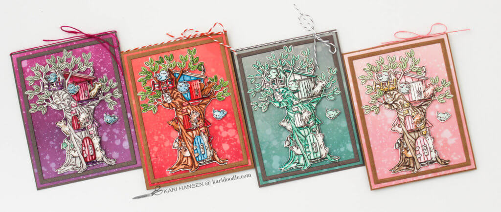
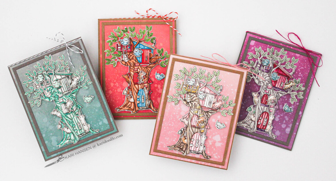
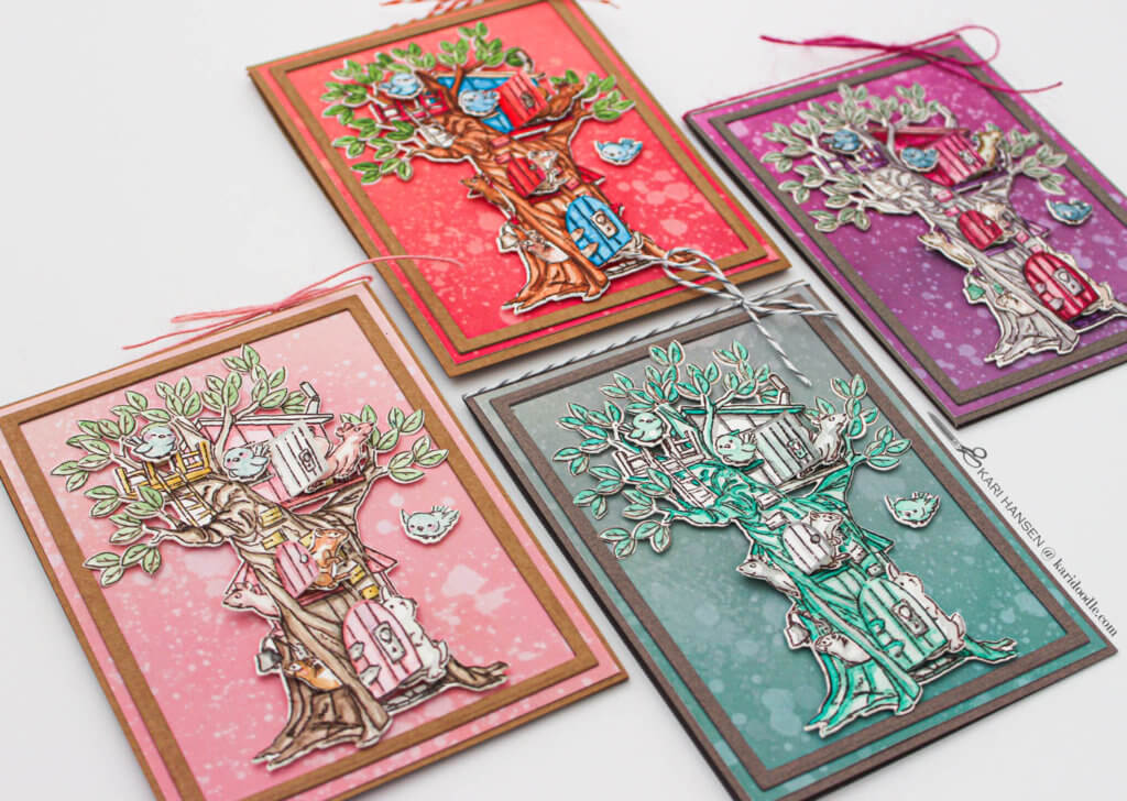
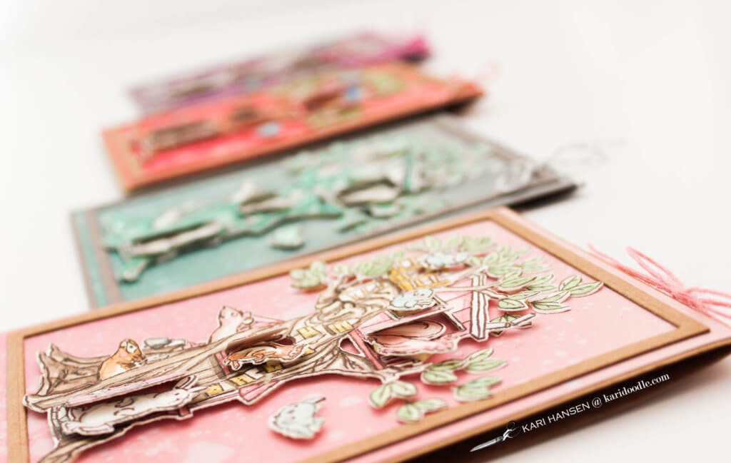
Four Color Scheme Examples Using One Stamp Set
Here are the color palettes I used on the four versions of cards using the same Art Impressions stamp and die set:
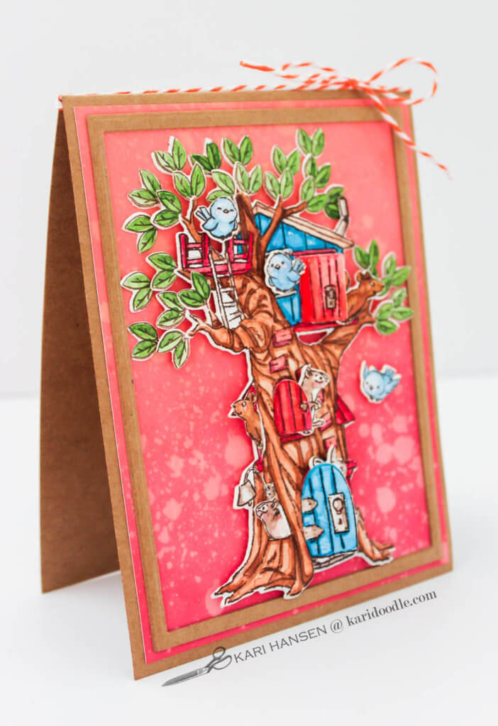
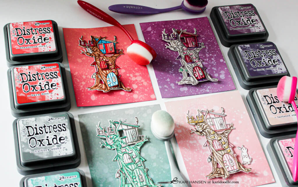
Vivid primaries: The classic color scheme, very similar to that shown on the stamp package, consists of pure intensity versions of apple red, leaf green, and sapphire blue on a walnut-brown tree. This vibrant, playful version would work for many occasions, including a masculine or juvenile card.
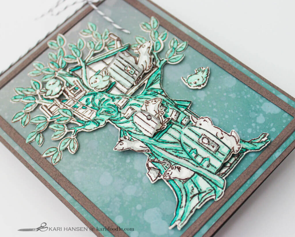
Simple monochromatic: A monochromatic color scheme sticks to variations of just one hue. Lighter and darker versions of the same green and grey are used here to create shading and highlights. The limited palette of jade green and grey on this card creates the kind of simple sophistication found in the pastoral scenes of toile fabric.
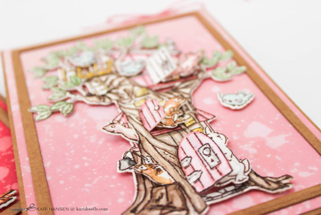
Pale Tints: A tint is a hue with white added, or in the case of watercolor, the pigment is diluted with water. Rose and shell pinks, butter yellow, mint green, and sky blue on a light brown tree create a soft and sweet woodland scene. Done in this pale pastel colorway, the image reminds me of a classic storybook illustration.
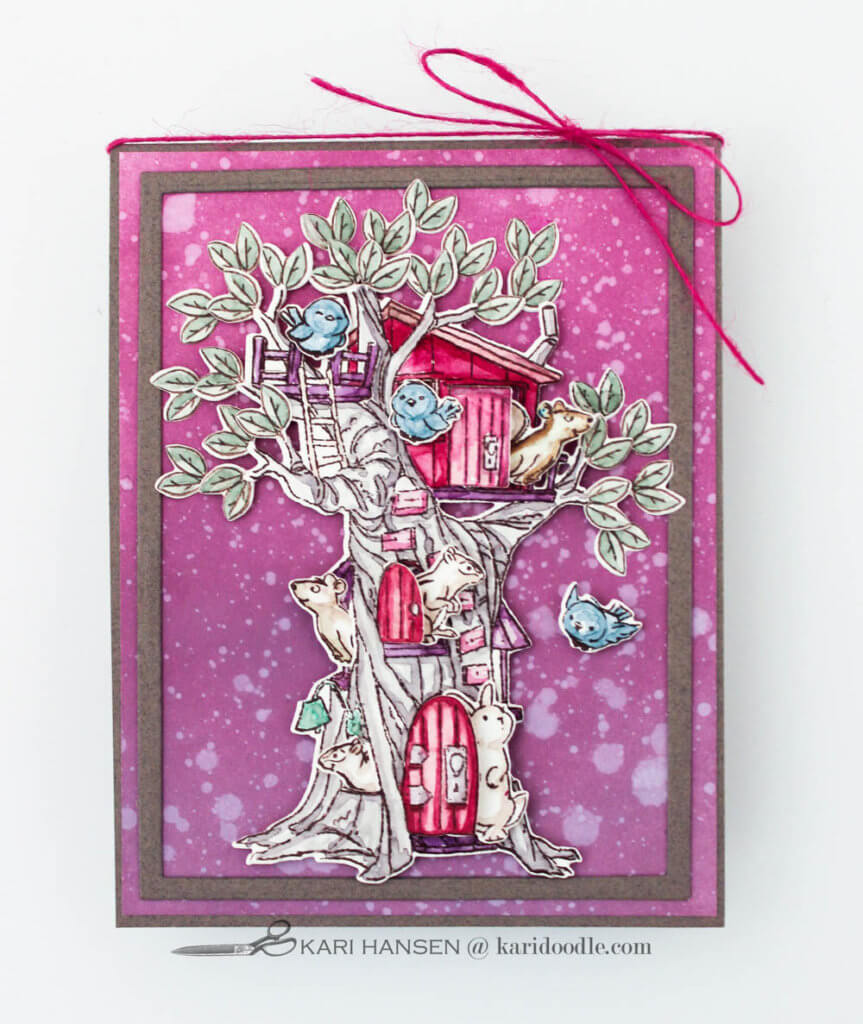
Muted Tones: A tone is a hue with grey or its complementary color added, resulting in a muted intensity. By adding touches of grey to a hue in your watercolor palette, a range of mellow tones can be mixed. Raspberry red, dusty grape, sage green, and cornflower blue coexist with an aged grey tree in this rich color scheme with jewel-like femininity.
I kept making critters and cubbies until half-past my bedtime and my paint passion had run its course for the present. And finally, I breathed a contented crafter sigh and put my sand-paper eyeballs to bed.
Do you have some figurative stamp sets you could try in some unconventional color schemes? Can you create a whole new look by imaging the color scheme in a fresh way?
How to Make a Woodland Tree Cubbies Card: Step-by-Step Tutorial
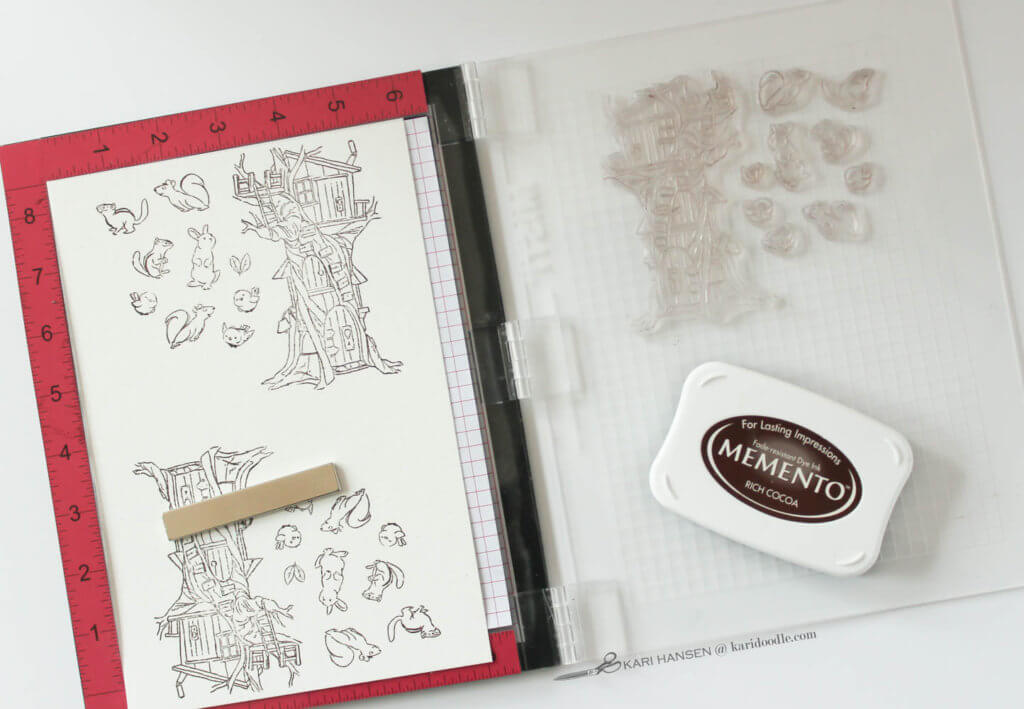
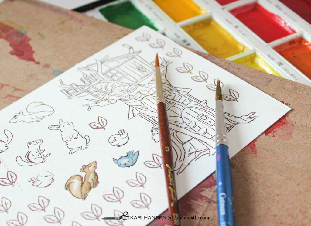
- Stamp images: Using a stamp positioning tool (Misti), arrange the tree stamp and all the critters on the hinged door. Stamp images with dark brown waterproof ink (Memento Rich Cocoa) onto watercolor paper (Canson XL cold press). I stamped the images twice to ensure crisp lines on the textured paper. Because I was making multiple cards, I rotated the sheet of paper and stamped the same images again.
- Stamp extra leaves: Place leaf stamp on a small acrylic block. Stamp multiple times into empty spaces on watercolor paper. I used about 24 leaf clusters for each card.
- Add color: Use watercolors (Kansai Tambi) to paint the tree, critters, and leaf clusters. Copic markers, colored pencils, and many other coloring mediums would also work well here. Allow to dry completely.
- Die-cut images: Place dies over corresponding images, securing in place with low-tack tape. Run through the die-cut machine. Repeat as needed to die-cut all the leaves.
- Ink-blend background: Create a background by blending ink onto white cardstock. I used two colors of Distress Oxide inks (Ranger) and blending brushes (Taylored Expressions) for each background panel. Spritz on water droplets and dab off with a paper towel. Allow to dry.
- Trim panel and create frame: Trim ink-blended panel to 4-1/8 x 5-3/8”. Die-cut frame from kraft or grey cardstock with a rectangle die slightly smaller than background panel. I cut the frame twice from the same cardstock and stacked them together using liquid glue. Adhere frame to the background panel.
- Make card base: Cut and score to create a top-folding A2 (4.25 x 5.5”) card base from kraft or grey cardstock. Adhere the finished panel to the card base.
- Assemble scene: Adhere about 12 leaf clusters to the ends of branches with liquid glue. Insert critters into the two bottom-left openings on the tree, trimming and adhering in place as needed. Place foam tape on the back of the tree, avoiding any door or window openings. Adhere tree to the card panel. Adhere remaining leaf clusters tucked behind the popped-up leaves with liquid glue. (I like the look of a few leaves overlapping the frame a bit.) Adhere remaining critters in doors, windows, and the balcony using foam tape.
- Finish details: Stamp sentiment on the inside of the card. Tie twine in a bow at top of the card.
Doodler tip: To create a thin frame from nested die-cuts with consistent width so they can be stacked together, try this trick. Pick two dies that are graduated in size. Lay the dies together, face down, straight, and centered. Hold them in place with one hand while placing low-tack tape on each side. Keep the dies taped together as you die-cut each frame.
Here’s more cards with Distress Oxide ink blending: How to Make Valentine’s Cards with Scandanavian Style
Supplies
- Woodland Tree Cubbies stamp & die set, Art Impressions
- Memento rich cocoa ink, Tsukineko
- Kansai Tambi watercolors, Kuretake
- Cold press watercolor paper, Canson XL
- White cardstock #110
- Kraft cardstock
- Grey cardstock
- Distress Oxide ink, Tim Holtz for Ranger: Seedless Preserves, Dusty Concord, Barn Door, Abandoned Coral, Picked Raspberry, Tattered Rose, Hickory Smoke, Evergreen Bough
- Rectangle die set, Kat Scrappiness
- Twine
Tools & Adhesive
- Stamp positioning tool, Misti
- Acrylic block
- Paintbrush size 6
- Paintbrush size 4
- Die-cutting machine, Spellbinders Platinum 6
- Blender brushes, Taylored Expressions
- Distress spray bottle, Tim Holtz for Ranger
- Foam tape, 3M
- Adhesive runner, K
- Liquid adhesive, Lawn Fawn